")


")
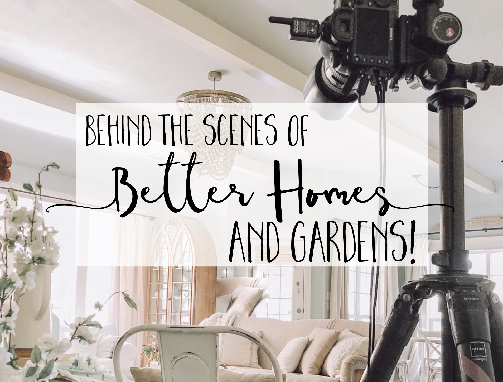
In the past year, we’ve had Better Homes and Gardens in our home twice to style and shoot content for two publications, and lemme tell ya: I’ve learned SO MUCH by watching the pros work, dang! The first time they came was for a Christmas shoot [see behind the scenes HERE], and this time the focus was on vintage and flea market pieces. Both times they’ve come, I’ve tried my hardest to soak up as many photography, lighting, styling and general tips and tricks that I can, because these people know what they’re about, y’all. Here are a few things I learned from last week’s BHG shoot for Best of Flea Market Style!
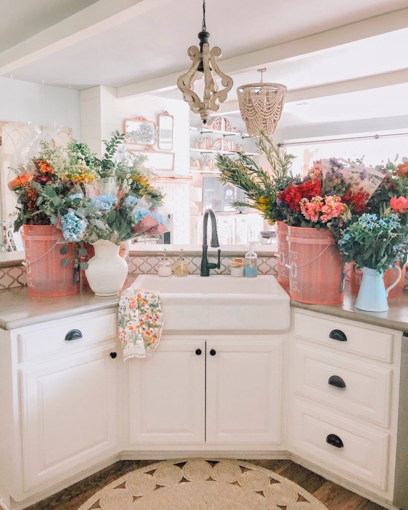
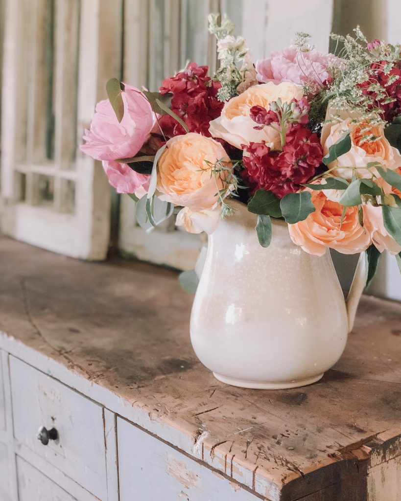
1 – Fresh Flowers are always a good idea
And they weren’t kidding!! Look at all those sweet smelling beauties! Jessica the editor/director of our shoot brought in buckets and buckets of blooms so that we’d have lots to choose from while styling shots around the house, and I gotta say…it felt so nice living in a garden for a week, ha! Now, if you’ve followed me for awhile, you know I’ve got some serious black thumbs when it comes to gardening and keeping green things alive, but even this faux plant lady has to give it up for the specialness and true beauty of fresh flowers. I might not be able to keep them around all the time, but this shoot reminded me to bring home a little blooming bouquet or two every once in awhile…and just try my best to keep it alive for more than two seconds. 😂
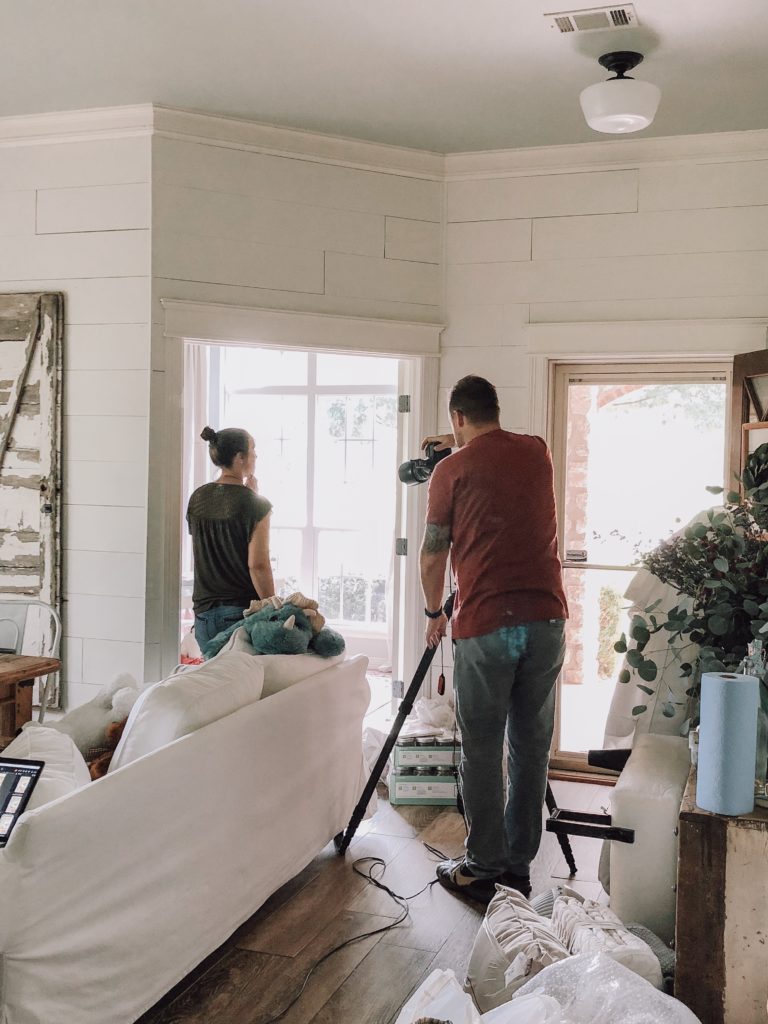
2 – Don’t be afraid to move furniture to get the shot
Many times, I am just snapping a pic for Instagram on the go, so you’ll see stray socks in the background or not-totally-thought-out styling, and that’s more my vibe. I love perfectly set and styled images as well, but I also need to LIVE here in this house o’ ours. A little life in the picture seems more “real” to me, mess or no. However, for purposefully styled images or for images used in collaboration with companies for campaigns, I was reminded during the photo shoot not be afraid to scoot furniture around a bit to get a clean, uncluttered shot. Probably not a tip I’ll use daily, but certainly one that gives me permission to shift and move things around a bit if I am focusing on a particularly styled shot!
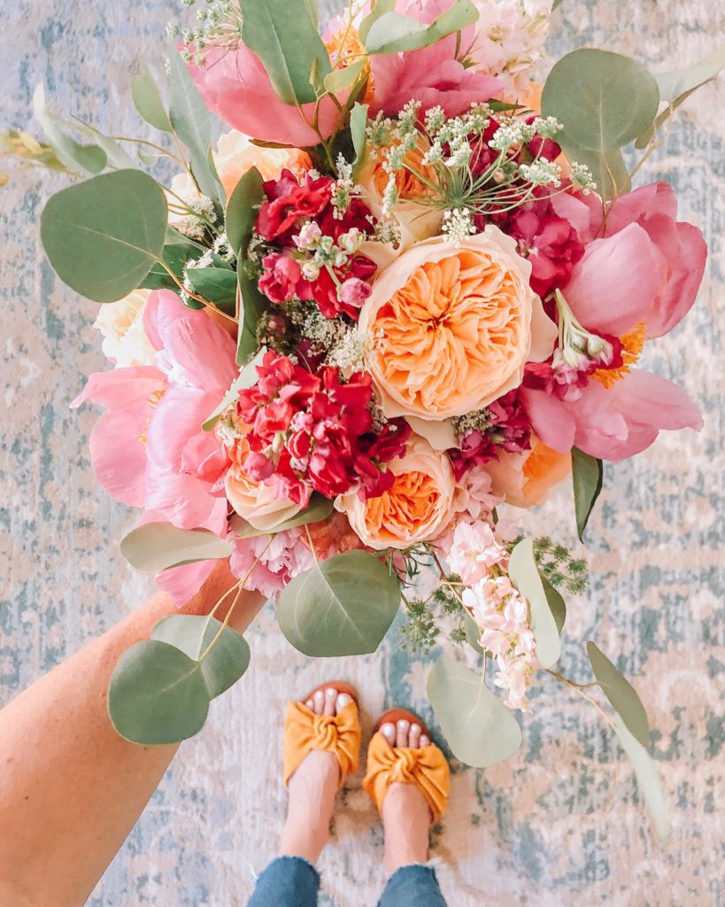
3 – Neutrals are great, but color adds life
In this cottage, farmhouse loving community, I know many of us are drawn to neutrals, neutrals and more neutrals, and I’ll always say that having a neutral base (walls, furniture, rugs, etc.) makes it easy to pop in seasonal color in a snap…which is just what the magazine team did! They asked for color, color and more color for the shoot! My neutral-loving heart was nervous at first, but you know what? As I worked ahead on special looks for the magazine spread and as Jessica helped pop in fresh flowers and interesting vignettes, I started to realize that maybe I’m ready for a bit less neutral and bit more color in my home. Again, having that neutral base will make it easy, and I’m excited to experiment with more color moving forward…for now, anyways. That itch to switch is real, yo. 😉
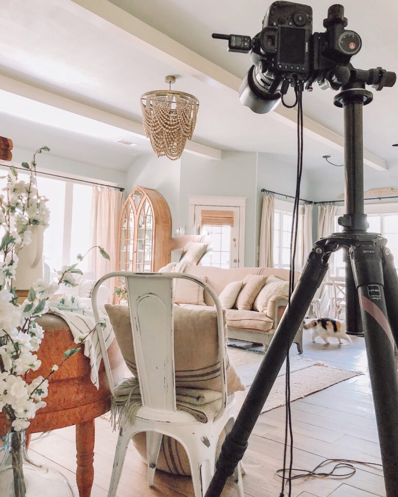
4 – Set, reset and reset again…then shoot
After the shoot wrapped, I was flipping through a magazine while out on the golf course with my hubby a few days later, and I had to chuckle at some of the shots. Previously, I truly believed that those images were just easy, breezy, “we just blew in here, shot a few angles and breezed out”…and I couldn’t have been more wrong. Do you see a magazine shot that includes a vase of eucalyptus stems arched oh so perfectly? Guarantee that vase of stems has been touched, restyled and moved about 15 times to get the leaves angled juuuuuuuuuust right. See a bowl of lemons sitting by a sink? Promise that those lemons have been rearranged and regrouped more times than you’d ever guess! In other words, at both of the magazine photo shoots in our home, I was AMAZED at how many itty bitty details of the shot are set, reset and then reset again before the camera ever snaps a final image. Of course, I’m usually snapping on the go with more of a lifestyle feel for my IG, but this observation reminded me to sometimes slow down and really SEE the subjects of my images, to take note if a simple tweak or change could really bring the shot together or clean it up in a sense. And…I’ll never look at a home decor magazine picture the same way again! So much work goes into each image!
5 – Simple is better
This is a design philosophy that has been slowly but surely making its way into the forefront for me over the past few months as I think ahead for seasonal decor. The farmhouse style can tend toward the busy, the full, the bursting at the seams feel, and I personally love that look, too. Reads cozy and homey and so visually interesting. But at the same time, I’m craving a little bit less…stuff. Perhaps it’s because our personal lives are a bit on the extra full side right now, and I want to make our home a place of peace and simplicity to counteract that…? Or maybe I’m looking down the barrel of the crazy busy holiday seasons fast approaching, and that’s making me crave a beautifully simple vibe. Either way, it was interesting to note how the pros at the shoot paired things down and let the flea market and vintage pieces speak for themselves with just a touch of fluff to add interest. Hmmmmm…..kinda thinking I’ll give this concept a try! Craving a bit more simplicity, and watching the professionals at this photo shoot lean toward simplicity really drove that idea home for me. (Although I will say this: “simple” probably means different things to different people. For example, last year I loaded every single surface with fall pumpkins until it was bursting at the seams, and I LOVED it then! So for me, “simple” will maybe look like only a handful of pumpkins…but even that might be “busy” to someone else, you know? 😂 All about personal style and perspective, but just sharing where I’m at with it!)
Thanks for following along with me over on Instagram [HERE] and for stopping by the blog to see behind the scenes of the Better Homes and Gardens photo shoot! We loved having them here, and it was certainly an experience I won’t soon forget. Hope these tips and tricks were helpful to you, buddies!
❤️ERIN
![]()


Hi Erin! Hope you’re doing well! This is Emma, we’ve connected awhile back. Please check your email! Definitely understand that running Cotton Stem and Mommin’ ain’t easy! 🙂 You’re amazing Mama!
Appreciate your time!
– Emma
I loooove color! So I am excited to see you infuse it more into your decor!
This was so fun and interesting to read Erin! I love the tip about color and also letting some pieces speak for themselves and adding a little fluff. 🙂 Can’t wait to see this when it comes out! I can’t get over the colors of those flowers with your shoes! 🙂
I’ve always been a less is more kind of girl when it comes to decorating, but I could definitely use a nudge in the color department.
I’m sure that was an amazing experience!! Thanks for giving us a bit of the inside scoop!!! Can’t wait to see it all in print! 🤗
Love the simple vibe!! A few years ago, I started to feel like even when my house was clean, it didn’t feel clean. And I swear it was like a light shined down and was like “you have too much crap on those shelves! And that buffet! And your mantle!” Hahaha! I pared it down and I feel so much less stressed!! Crazy how little things like that make such a big difference.
Love your style…it’s fresh it’s uncomplicated..so very lovely and reflects what we see of you. Love your IG and blog and look forward to the upcoming holiday season with CottonStem. ♥️
I would like to have your blog posts emailed to me. Details below. Thank you.
I would like to have your blog posts emailed to me. Details below. Thank you.
Love your decorating style! I’d like to have the paint color from the living room and the off white color you have used elsewhere. Everything is awesome. Would like your blog sent to my email.
Thank you.
Myra
Love this post! My simple would be picking just one thing but doing loads of it – like your pumpkins on every surface decor but just one colour pumpkin throughout and nothing else – just pumpkins! That’s got me excited for fall now!! Yay!
I’m aching to find out how your blue drawers are styled. The ones Mr. Stems bought you. I spy them in the picture…they look like they are styled super cute!
Hi Erin,
I was out shopping yesterday and picked up the 2018 Better Homes&Gardens CHRISTMAS IDEAS issue. I flipped through and landed on page 23 and promptly bought the magazine! I love your home and style!
Today I visited your blog and subscribed. I am looking forward to reading all of your interesting posts. Thanks for sharing your many talents with others. I’m sure I will learn how to apply some great ideas to my home. Blessings, Sandi
I love the neutrals but that pretty color is gorgeous! There is something so life-giving about fresh plants and flowers