")


")
Hey pals!
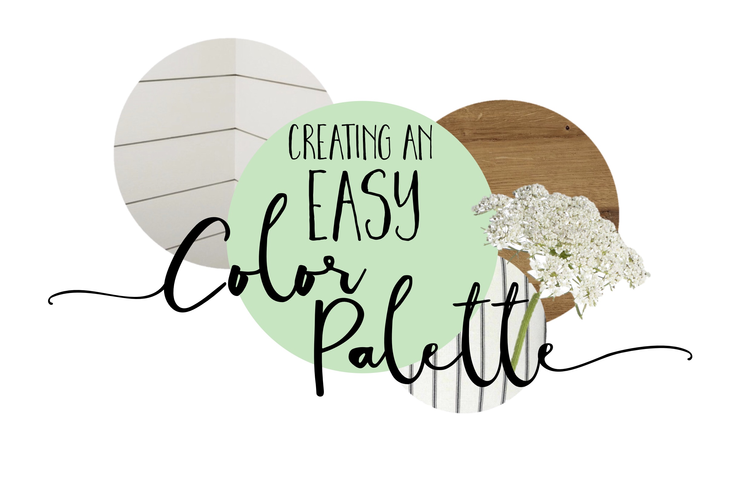
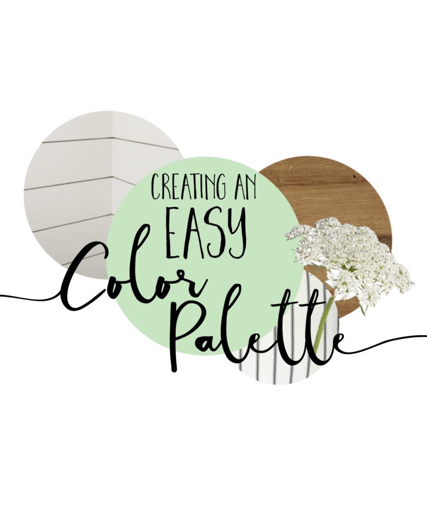
Thought it would be fun to show y’all the super duper simple way I formulate a color palette for a room I’m designing or redoing, and maybe this simple trick can assist ya as you create beautiful spaces in your own home! All you need is to identify your base/existing colors, add pop of color, plus some texture pieces and boom! Quick and easy color palette for any room or season. Let me show ya how my brains work…if you dare! 😉
 1 – Identify Your Permanent Colors
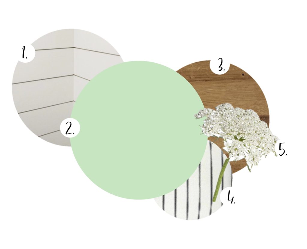
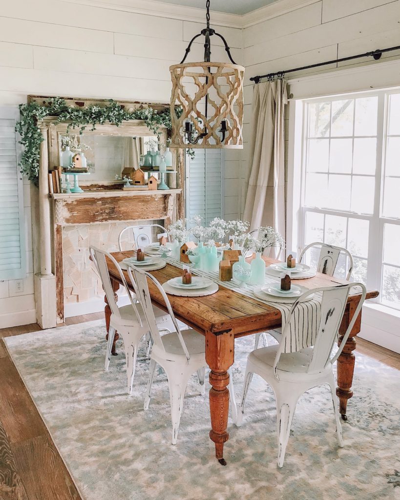
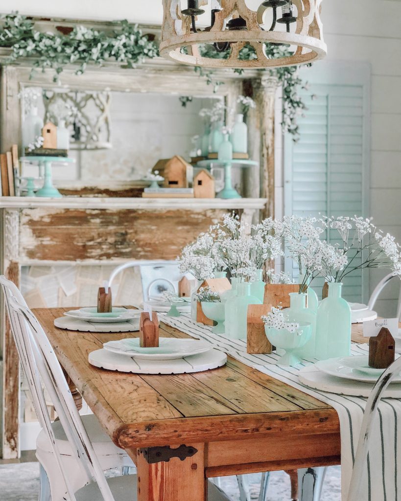
Whenever I want to create a new look for a room in my home, I start by identifying the colors/patterns/textures that are pretty permanent. For example, I’m probably not going to be changing out rugs, paint, window treatments and major fixtures every time I get the #ItchToSwitch up my decor, so those colors need to be taken into consideration as we build out a new color palette. For my dining room, I knew that the white shiplap walls (#1) and the vintage farm table (#3) were some of the permanent items that needed to play nicely with whatever new colors came to play. Identifying these base colors and textures helps you sort of stay in your lane so you don’t break the budget, but it also allows your creativity to soar in a realistic way once you’ve found your boundaries at the start! Does that make sense?
2 – Find Your Inspiration Color
Next, I like to identify my inspiration piece/color and build out the rest of the room around it. Sometimes I know exactly what I want to create and go source items and colors after the realization, and then other times I’ll just stumble upon a piece that sets the tone for the entire room and find colors that go together from that one piece! This time around for my dining room, I knew for sure I wanted to focus on that happy Jadeite green (#2 above), and I’d been slowly adding to my collection over the last few months in order to do so. Because my base/permanent colors are so neutral, it’s pretty easy to play with colors and add fun pops to the space!
3 – Finish with Complimentary Colors
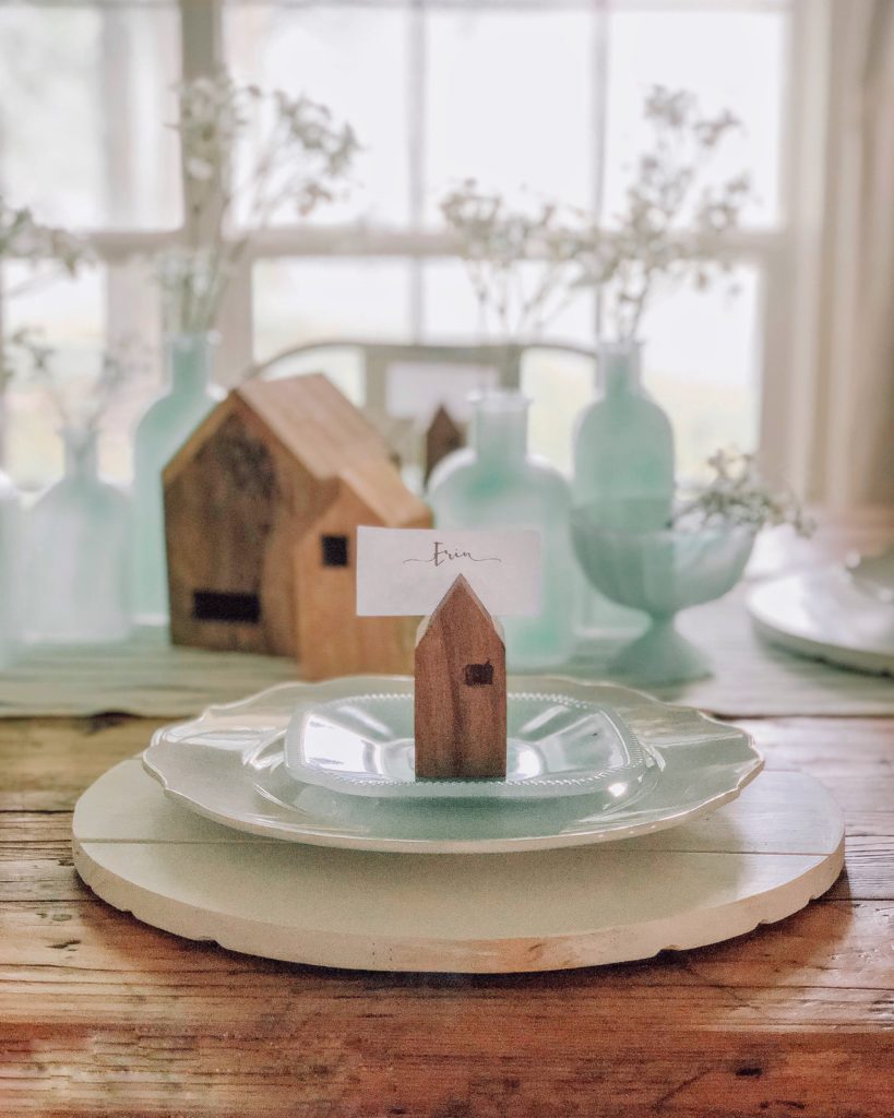
Knowing this creamy green color would take center stage, I decided to finish the palette by adding neutral colors and textures that added interest but let the Jadeite remain the star. Simple flour sack stripe table cloth (actually made from a few towels placed together!) and some faux Queen Anne’s lace added texture to compliment the brighter pop of color from the bud vases and plates without competing, and I think layering neutrals as accent “colors” is a great and easy way to complete a space by giving it texture!
 (Shiplap chargers from Sawdust Angel Boutique)
There you have it, friends: a quick and easy 3 step process to building a color palette for your space! Setting a palette before redecorating really helps me visualize my end result and stay on budget and on task. When I go in blind, I find myself getting a bit overwhelmed by the possibilities, but, armed with a color palette like this ahead of time, I know that I can dream and create and design all while staying within my palette boundaries…and the end result will be complimentary and cohesive! Try using this concept in your own space next time you feel a little overwhelmed or need some direction to get started!
❤ERIN
SOURCES:
(*some affiliate links used in this post)


These are super simple ways for anyone to redecorate – thank you for sharing them with us Erin! Now I am getting the itch….
Hi Erin, you know what I’ve found really challenging? Editing my decor items. I love when a room has decor pieces that feel cohesive but collected….layered but not overdone. Problem is, when I try to replicate something inspiring I’ve seen (or imagined) it just ends up looking hodgepodge, busy or worse… flat and boring! Do you have any tips (aside from the capsule decor method )? Thanks so much and all the hugs!
These are great tips! Love your posts so so much!!!
I love your Instagram and blog ! I’m building a new house ,love your kitchen cabinets! Could you please tell me what color chalk paint is on cabinets? I cant tell if its cream or white
Thank you!